photo found on Flickr
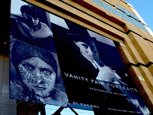
Pamela and I went to check out the Vanity Fair Portraits exhibit at LACMA. In all the time that I've lived in L.A., I had never been to the LACMA. Thankfully, Pamela had a LACMA membership and we got in for free. I was excited. Vanity Fair has been responsible for some of the most intriguing and beautiful portrait photographs. Here are some of my favorites.
 By Nickolas Muray, 1929; Vanity Fair, October 1929;
© Condé Nast Publications Inc./courtesy of Condé Nast Archive.
 By Josef Astor, 1996; costume designed and constructed by Joseph Hutchins & Company N.Y.C.; Vanity Fair, July 1996; © Josef Astor, 1996.
 By Anton Bruehl, 1935; Vanity Fair, November 1935;
© Condé Nast Publications Inc.; courtesy of the National Portrait Gallery, Smithsonian Institution/Art Resource, N.Y.C.
 By Cecil Beaton, 1935; Vanity Fair, July 1935;
© Condé Nast Publications Inc./courtesy of Condé Nast Archive.
 Photograph by Annie Leibovitz; styled by Michael Roberts.
 Photograph by Steven Meisel; styled by Arianne Phillips.
When walked into the exhibit, we were underwhelmed. The prints were small and poorly printed. I am aware that it's a technical complaint, but it really took away from the overall show. One of the things I love about going to a photography exhibit is viewing large prints and discovering nuances and details that I never noticed before. The majority of prints were the same size as the magazine. If I wanted to see them that small, I would have picked up the magazine. The biggest disappointment is that it would appear that the prints of the 1930s photographs were reproductions of prints, not prints from the negatives. In essence, we were looking at a room full of copies that could have been made at Kinko's! It was disappointing.
Aside from the poor prints, the overall exhibit seemed poorly thought out. A few of the well-known magazine covers were showcased, but there were a lot of random bland photos. As a result, I was bored. This has NEVER happened in my adult life. I love photography exhibits so much that I've been moved to tears in good ones. I was dumbfounded and saddened.
If the exhibition hadn't already ended, I'd say skip it. If you didn't catch it, you didn't miss anything. If you want to see fantastic portrait photography, I suggest you go to the National Portrait Gallery in D.C.
To get the the taste of bad art exhibit out of our mouths, we did took a few photos of our own.

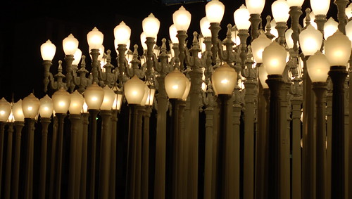
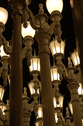
Sculpture Installation: Urban Lighting by Charles Burden


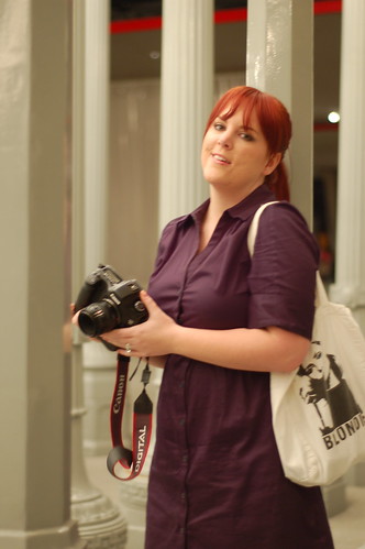
A candid of Pamela
In the end, the conversation provoked by the bad exhibit was well worth the trip. Thanks to Pamela for getting me in for free. {I would have kicked myself had I paid to get in.}


2 more coherent thought(s):
I agree 150% with your review =)
The look on my face in the candid you shot shows my disappointment, right?
We don't put enough of a priority on film and negatives! Until they learn to replicate the layers and grain of film with digital, they really should stick to prints from negatives when available. They took something magical and turned it into a cheap digital print. I'm surprised they didn't just throw a bunch of mypublisher books out for us to scope! It was about the same quality!
God Katherine Hepburn looks fantastic!
Love them all!
Post a Comment